Renowned Ghanaian media personality Obaa Tiwah has officially unveiled a new logo for her brand, marking a significant evolution in her public identity and professional journey. The redesigned logo is more than a visual update. It is a strong statement that reflects her bold character, confidence, and undeniable presence as a queen in the media space.
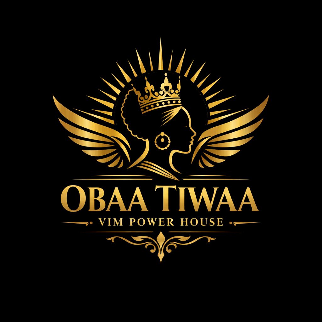
According to Obaa Tiwah, the new logo was intentionally crafted to mirror her personality and values. It represents strength, resilience, leadership, and authority, qualities that have defined her career over the years. As a media figure known for speaking her mind and standing firm in her convictions, the logo captures her fearless approach to storytelling and public engagement.
The queen symbolism embedded in the design highlights her dominance and influence in the media industry. It positions Obaa Tiwah as a woman who owns her voice and commands respect, while still inspiring others to embrace authenticity and self worth. The bold elements of the logo reflect her unapologetic stance on issues, her confidence on air, and her ability to lead conversations that matter.
Beyond aesthetics, the new logo signals growth and brand maturity. It aligns with Obaa Tiwah’s expanding influence across media platforms and reinforces her commitment to excellence, professionalism, and impact. The rebrand also speaks to her audience, reminding them of her consistency, courage, and dedication to staying true to herself despite public scrutiny.
Fans and industry observers see the logo change as a timely move that solidifies her brand identity in a competitive media landscape. It reinforces her image not just as a broadcaster, but as a powerful media force and a symbol of female leadership.
With this new logo, Obaa Tiwah continues to redefine her brand narrative, embracing her role as a queen in the media who is bold, vocal, and unapologetically authentic.